Skein's Design Journey: Finding a Visual Language
Skein is the iOS knitting and crochet companion I’ve been building. Import a pattern, get a clean teleprompter-style follow-along that remembers your place. I’ve written about the parsing engine before, but this post is about the other thing I’ve been quietly stewing on for months: how the app actually looks.
The short version: the early Skein was Claude’s best guess at a knitting app from a few prompts. The current Skein is a real piece of design.
Where it started
When I started building Skein, the UI grew the way a lot of AI-assisted projects grow. I would describe a vibe, Claude would build something, I would tweak it, and we’d move on. The result was a competent but characterless app: pastel backgrounds, standard SwiftUI shapes, a different color theme on every screen because each session of “make this nicer” pulled in a different direction. The Patterns list was peach. Projects were lavender. Settings were mint. The teleprompter was dark. None of those choices were wrong, and none of them belonged to the same app.
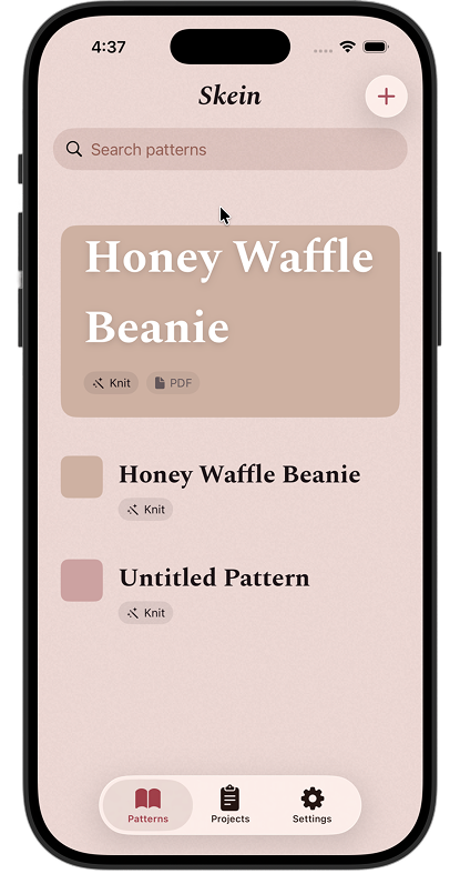
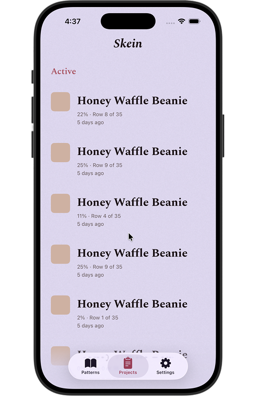
What it actually felt like, opening the app, was a stack of well-built rooms with no house around them. Each screen had been polished in isolation. None of them spoke to each other. The thumbnails on the Patterns list were colored placeholder squares. The pattern detail was a stack of generic rows. The project detail led with a giant percentage number because that’s what idea-of-progress looks like to a language model. It worked. It just had no point of view.
The other quiet problem was how hard the app leaned on default iOS chrome. System search bars. System tab bars with the new translucent Liquid Glass treatment. Standard rounded-rect pill buttons in the system tint. Each of those is well-designed by Apple in isolation, but they belong to every iOS app, which is the exact opposite of what a knitting companion with a strong point of view needs. The glass blurs and the soft system surfaces are an aesthetic Apple has chosen for the OS itself, not for warm-paper-and-Spectral-serif. The app was borrowing too much of the system’s voice instead of finding its own.
The paperclip era
Before the pastels, there was a skeuomorphic detour. This is the part I usually skip when I talk about Skein, partly because I don’t have screenshots from that period, and partly because writing it down makes it sound worse than it felt at the time.
Index cards with paperclips clipping them to a corkboard. Thumbtacks pinning down sticky notes that didn’t actually do anything. A brass plus button that floated like a service bell. A “workbook spread” for the project view, complete with handwritten labels in a script font, because a project is sort of like a school journal, right? Each piece had its own internal logic. None of them shared a logic.
I was trying to inject personality by force, and what I got was three different fantasies stitched together: a card-catalog drawer, a school workbook, a hotel concierge desk, all doing decorative work without semantic work. A paperclip should mean something. A thumbtack should mean something. In that version of Skein, they meant we are being warm and analog at you, which turned out to be no instruction at all.
The lesson I didn’t have words for yet: skeuomorphism is a tax on the user’s attention if it isn’t paying for itself in meaning. The redesign would eventually arrive at a single metaphor that does carry meaning. But first I had to give up on the buffet of metaphors that didn’t.
The pivot: Skein is a library card catalog
The turning point was deciding to stop iterating in code and sit down in Figma. Not because Figma is magic, but because the code path had me solving the wrong problem (which shade of cream, which corner radius) while the bigger question went untouched: what is this app, visually?
I spent a long stretch mocking up every screen in Figma against that hypothesis. Cream paper. Bold italic serif for titles, like the spine label on a hardcover. Monospaced small-caps for the supporting metadata, the kind you find on a Dewey Decimal card. Dotted-leader rows (“Yarn ………… Worsted, 85 yards”) to handle key-value information without ever needing a table. Filigree corner ornaments on project cards, because a project is the personal piece of the system, the thing you put your own decoration on. A dusty 8-color yarn palette, used as a per-project accent tint, hashed deterministically off the project ID so each project owns its color.
It was the first time the app had a unified answer to “what is this thing supposed to feel like.”
The whole foundation got locked into a single phase before any code moved. Color tokens. Typography tokens. A yarn palette and resolver. Six new components, all with previews in light and dark mode and a Dynamic Type matrix. A filigree SVG corner ornament bundled once and rotated four ways for the four corners of a card. Roughly thirty design decisions written down before a single line of UI code was touched, so the screen-level work that followed inherited a contract instead of a vibe.
The design language, briefly
What it feels like, mostly, is a card from a real catalog drawer that someone’s been pulling for forty years. Warm cream paper that has yellowed a little. Bold italic serif for the spine label. Monospaced small-caps with dotted leaders for the boring-but-load-bearing facts. A single accent color per project, like a colored tab clipped to the top of the card so you can find it again. Filigree at the corners on the personal stuff. Brick red under the section labels because index cards have a stamped underline.
The actual primitives, for anyone curious:
- Typography. Spectral italic for everything that wants to be read first. Courier Prime at 9pt for the small-caps section labels that sit under it. That combination is doing most of the work.
- Color. Cooler off-white for “page” surfaces, warm cream for “card” surfaces, brick red for the 1px section rule. Brass is fully retired.
- Components. A single filigree SVG corner ornament, bundled once and rotated four ways. A dotted-leader row for any label-value pair. A red-and-cream toggle. White square buttons replacing the brass FAB. A deterministic per-project tint from an 8-color dusty yarn palette.
- Out: paperclips, thumbtacks, the brass FAB, the handwritten workbook spread, the brand stamp, the old hero pattern cards, the per-screen pastel palette, default iOS Liquid Glass chrome on top-level surfaces.
None of those individual pieces is wild on its own. Together they speak the same language. That’s the whole game.
The screens, before and after
The work after the foundation was screen by screen, one phase per surface, roughly in the order a new user would meet them.
Patterns list
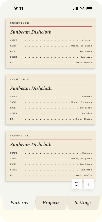
The peach background went away. The placeholder card thumbnails went away. The big featured “Honey Waffle Beanie” card at the top, which was doing too much work pretending to be a hero, became one row in the same scanning surface as everything else. Each pattern is now a call-number card (CROCHET 26-223, Spectral title, dotted-leader metadata), and the whole list reads at a glance. A pair of white square buttons (search, add) replaced the generic plus in the nav bar.
The thing I learned: scanning lists don’t need heroes. Make every row do the same amount of work and trust the reader to find their pattern.
Pattern details
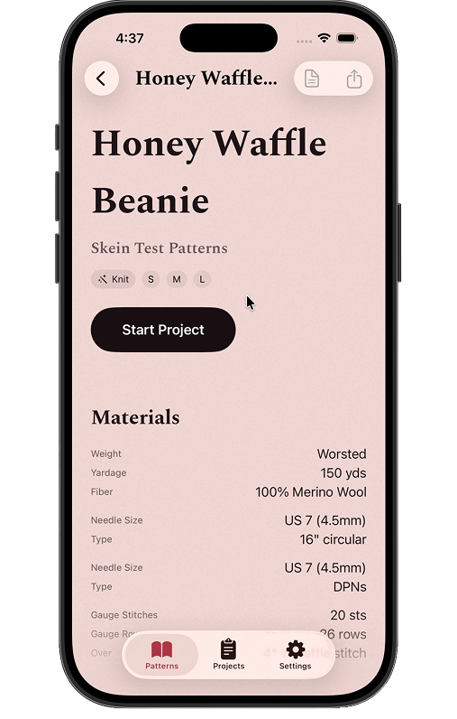
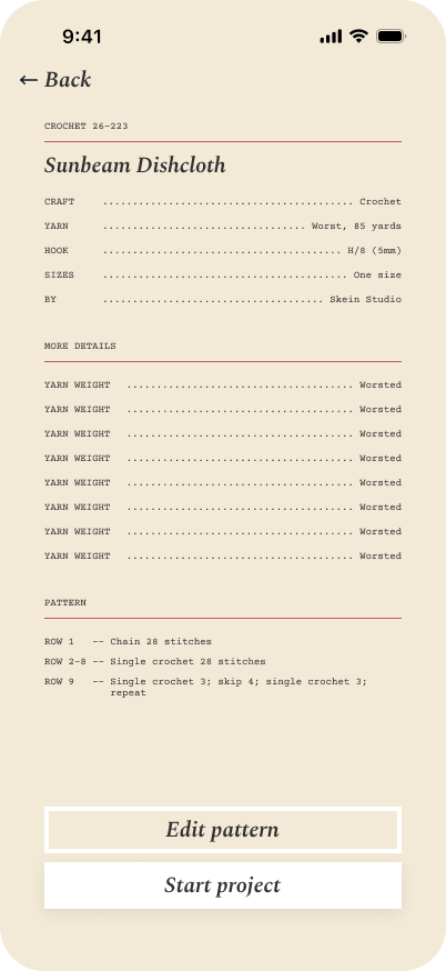
This is where the dotted-leader rows really earn their keep. Craft ………… Crochet. Yarn ………… Worsted, 85 yards. Hook ………… H/8 (5mm). The two-button pinned bar at the bottom (Edit pattern, Start project) is the only thing the screen has to commit to, and it sits in the same cream as the page so it never feels like a stuck banner.
The dotted leaders earn it. A pattern is a card from a catalog drawer, and the screen finally agrees.
Add a pattern
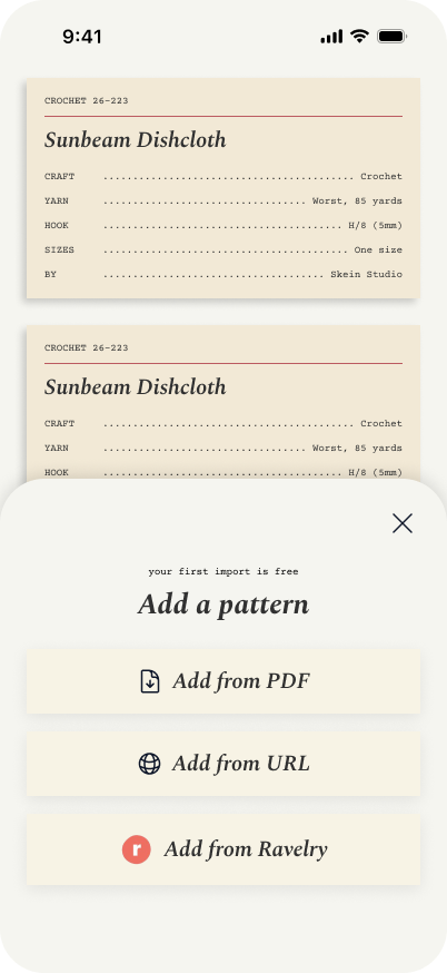
The Add a Pattern sheet is one of my favorite small wins. Three import options (PDF, URL, Ravelry), each as a cream pill with a Spectral-italic label and an icon on the left. The line your first import is free sits above the title in the same small-caps Courier as everywhere else, doing legitimate work as a quiet onboarding nudge.
Sheets are usually where a design language cracks. Different surface, different rules, suddenly a Material-shaped thing sitting on a paper page. This one stays in the same world as the page underneath, and that’s the whole win.
Projects list
The Projects list is the home for the ornament corners. Each project gets a stable color from the 8-color dusty yarn palette, deterministically hashed off its ID, so the same project always wears the same color. It is the one place I let the app get a little decorative, because a project is the part of the system that’s yours.
Catalogs are uniform on purpose. The user’s own work is the exception that earns the ornament.
Project details
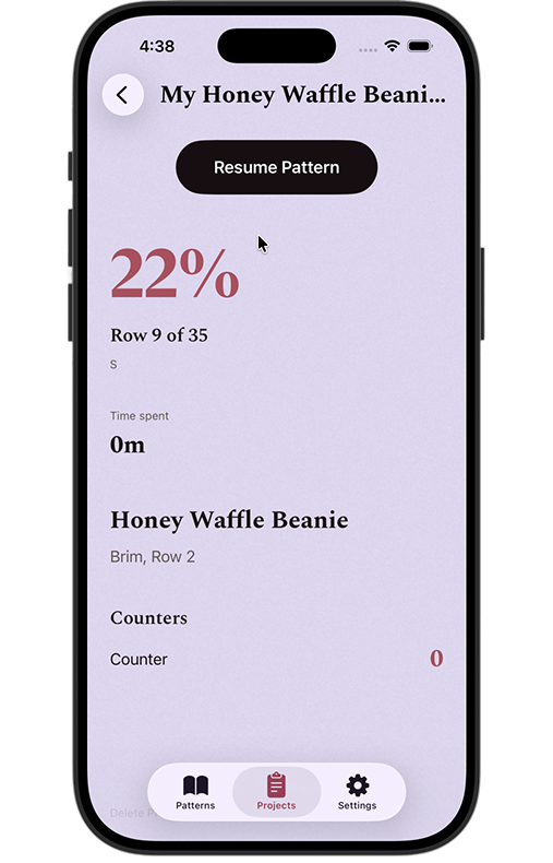
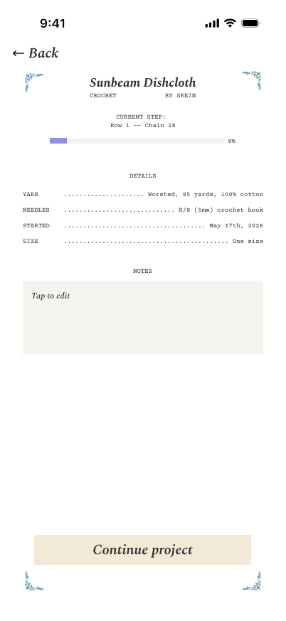
Project details was the most overgrown screen in the old design, and it became the most considered screen in the new one. The ornament-corner card frames the project. A DETAILS section in centered small-caps. A NOTES section with an inline text editor for the project’s notes (one of the few data-model additions across this entire pass, because every other change was visual). A pinned Continue button at the bottom that adapts to the four edge states the screen can be in.
The shift I’m proudest of here: replacing a number with a frame. Status used to be the loudest thing on this screen. Identity is the loudest thing now.
Settings
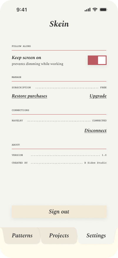
FOLLOW ALONG then one toggle. MANAGE then subscription state with dotted-leader rows and underlined Restore purchases and Upgrade action links. CONNECTIONS then RAVELRY ………… CONNECTED with a Disconnect action. ABOUT then version and credit. None of it is novel UI. All of it tells you, in a glance, that this is the same app as the Pattern details and the Project details.
The test of a design language is whether it survives the screens you almost forgot about. Settings used to be where the system fell apart. Now it’s where the system proves it works.
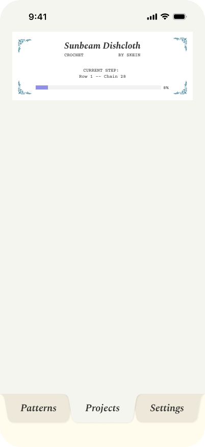
Teleprompter
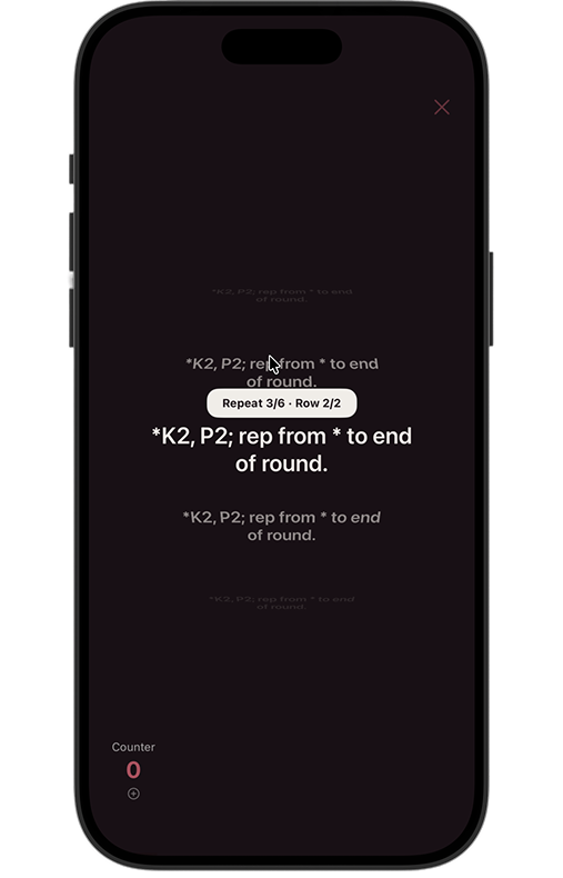
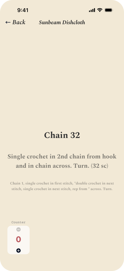
The teleprompter is the actual core of Skein (the screen you sit on while you knit), and it had been an island. Dark background, sans body type, no visual relationship to anything else in the app. The new version brings it into the cream-and-Spectral world. Big focal step in Spectral Bold. A softer faded peek of what comes next. The counter widget gets a real place in the corner instead of clinging to an edge.
The core screen of an app shouldn’t be the one that doesn’t match. The teleprompter used to feel like a different app. Now it feels like the one Skein is actually for.
What I’d tell past me
Three things, looking back:
- Don’t iterate visual identity in code. The first version felt productive because I was shipping commits, but I was solving the wrong granularity of problem. The Figma pass was slower per hour and ten times more useful per week.
- Pick a metaphor that does semantic work. A card-catalog drawer is right for Skein because the app is, structurally, a system of cards you keep and reference. A workbook isn’t, even though workbooks are charming. The metaphor has to earn its keep.
- Lock the foundation before the screens. Color tokens, type tokens, components, assets, all in one phase, before any screen-level work. Then the screens inherit a contract instead of redesigning the design system five times by accident.
Where it is, honestly
- Patterns list, Pattern details, the Add Pattern sheet, Projects list, and Project details are all rebuilt in code against the new system. Those are the ones with shipping phases behind them.
- Settings and the teleprompter follow-along are designed (the “after” shots above are Figma exports) and queued for their build pass next.
- New Project creation and a handful of smaller surfaces still need their own redesign passes, which is a known list rather than a vibe.
Skein doesn’t ship yet. But for the first time it looks like a product I’d download, and the gap between “Claude built me a thing” and “this is a piece of design” is finally closed. That’s the transition I wanted to be able to write about.
If you knit or crochet and want to see whether the card catalog actually works in your hands, email me at [email protected] and I’ll add you to the list.
